Forecasting
Benchmarks and Practice
Benchmarks
Critique of Prophet
My motivation to carry out the benchmark for time series algorithms stemmed from realizing that a decent number of time series experts strongly dislike Prophet. Their main argument is that it’s not an autoregressive model, being trend plus seasonality instead. We know many real-life processes are autoregressive, like stock prices or exchange rates - important processes that these experts think an algorithm must account for to be useful.
When researching this topic I came across the case of Zillow, the US real estate company that buys and sells homes. In 2021, they faced a major $300 million loss over a short period, which they attributed to failing to generate good forecasts. Consequently, they fired many employees.
The connection between this fiasco and Prophet was a Zillow job listing seeking someone skilled in using Prophet. Those criticizing Prophet jumped to conclude that their losses resulted from using Prophet for forecasting. Of course, others argued Zillow used complicated neural network or machine learning models, but this view did not gain traction. Even today, the Zillow case is frequently cited when arguing against Prophet.
After reading this, I wondered if I could find literature evidence that Prophet truly performs poorly. Surprisingly, such cases were easy to find.
But what really convinced me was the statement in Hyndman’s book - Forecasting: Principles and Practice, 3rd edition. He writes, “However, [Prophet] rarely gives better forecast accuracy than alternative approaches.”
Peter Cotton, another expert, has a blog post discussing Prophet’s shortcomings in detail while suggesting modifications to improve it. There’s even a tweet from Prophet’s creator, Sean Taylor, largely agreeing with Cotton’s criticisms.
Cotton runs microprediction.com, hosting a leaderboard ranking Python time series forecasting packages where Prophet scores 1600 while the top package scores 2100, showing a significant performance gap between Prophet and the leading algorithms.
Nixtla
So if Prophet underperforms, which package should one use instead? In my opinion, the answer is Nixtla. Their documentation is among the best I’ve seen - very organized, making it easy to find answers when starting to use their packages.
We should discuss the benchmarks Nixtla performed against the popular Prophet package. As a time series startup in California, outperforming the widely-adopted Prophet is crucial for gaining traction.
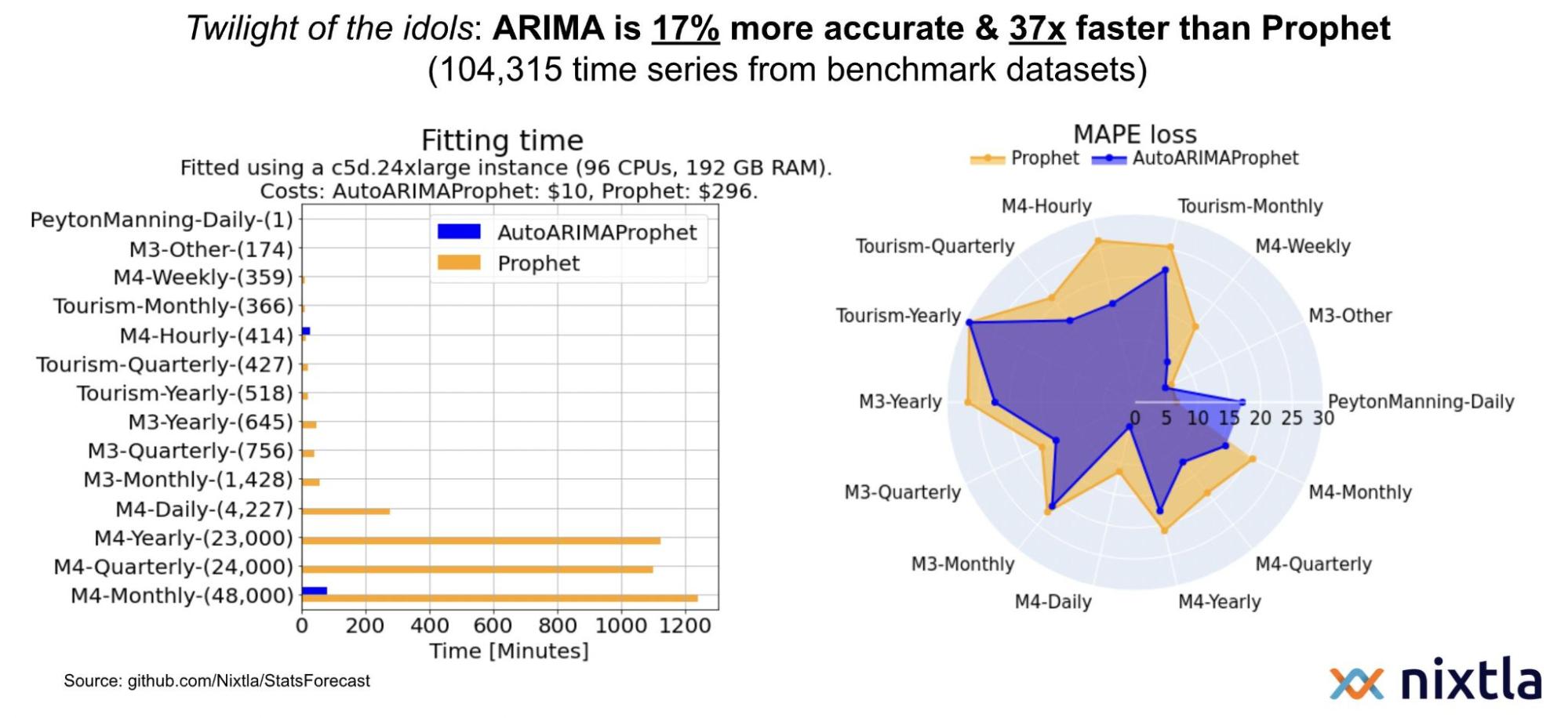
Their results show Nixtla’s implementation of statistical algorithms significantly outpacing Prophet in execution time across the M3 and M4 time series competition datasets, which use real-world data. For accuracy measured by mean absolute percentage error, Nixtla’s reimplementation often exceeds Prophet, though there are cases where Prophet performed better.
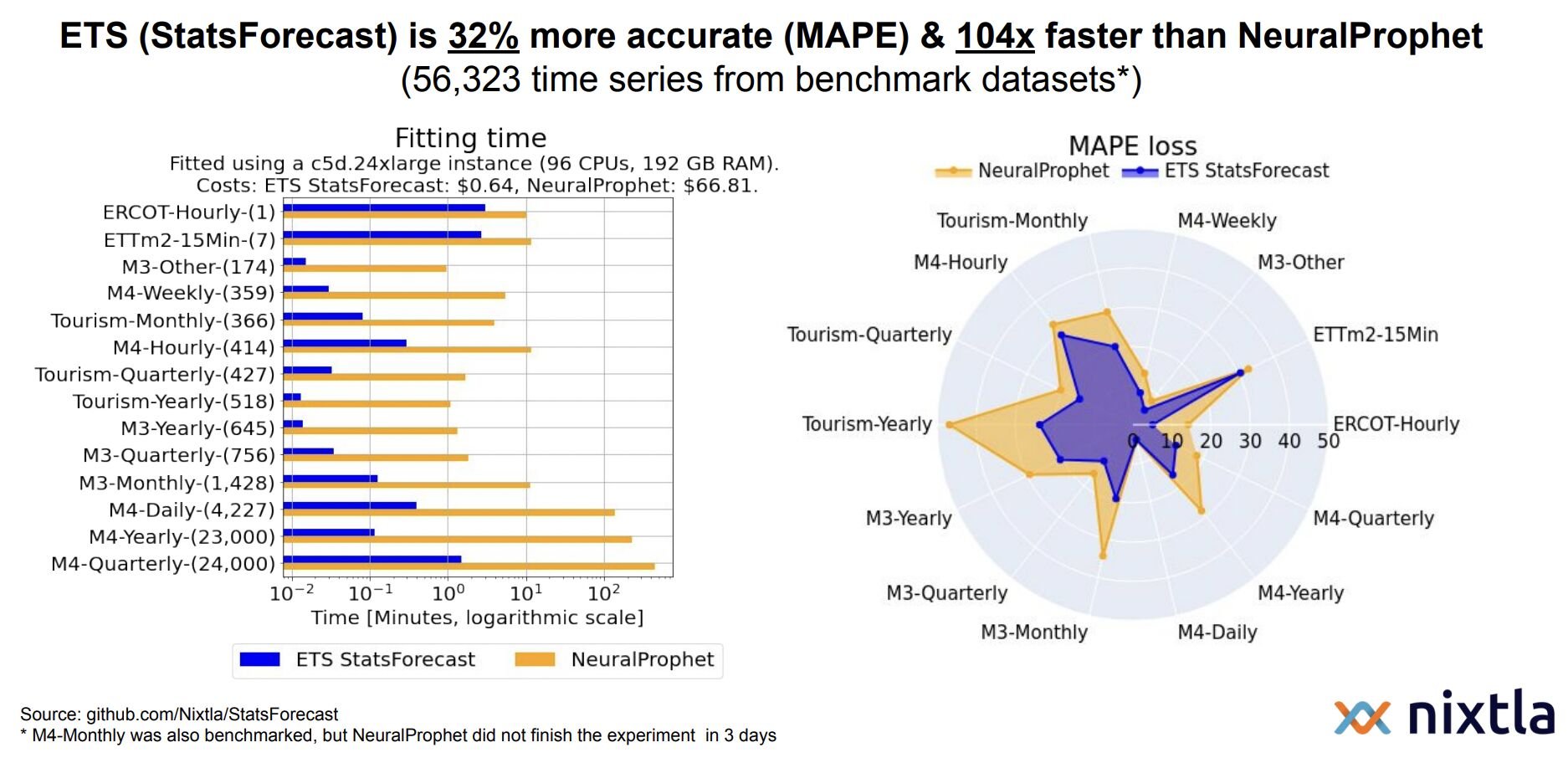
Comparing the neural network extension “NeuralProphet” to the vanilla Prophet highlights even starker speed advantages for Nixtla. The left chart below compares execution time. Note that we have a logarithmic scale here. What does this mean? A small difference on a log scale represents a huge difference on the original scale. They chose to present this comparison on a log scale because on the original scale, the blue bars are so small as to be nearly invisible. But that makes sense, since it’s based on a neural net, which is much slower than regression. The right chart below compares accuracy. We see the same story - Nixltla generally outperforms Prophet.
Nixtla vs Prophet
This section is basically about verifying what I just discussed on real-world data. At the company I work for, we have monthly sales data from stores across shopping malls in many countries. Imagine a company owning numerous malls, and you have sales data from every store in each mall - stores spanning fashion, restaurants, entertainment, a wide variety of domains.
While it’s simple monthly sales data, the number of time series I’m analyzing is roughly 3,000. A decent size, I would say, to conduct a solid benchmark.
What I’m going to do is compare Nixtla and Prophet based on this real-world monthly sales sample. I’ll start with the most interpretable and easy-to-understand metric: the Relative Mean Absolute Error.

Here, the numerator is the difference between the actual value $y_\tau$ and the forecast value, $\hat{y_\tau}$, which refers to either ARIMA, ETS, or CES forecasts. In the denominator, we have the Mean Absolute Error of the actual observed value, and forecast by Prophet, $\hat{y}^{base}$.
Basically, if that ratio is less than one, it means the numerator model (ARIMA, ETS, or CES) performed better. If greater than one, the denominator (Prophet) performed better.

You see these distributions are all less than one on average, meaning all three models did a better job than Prophet on this specific data.
The next few graphs look at the same point from different perspectives. Here I wanted to examine different metrics - RDM, which stands for Relative Deviation of Means (see the formula definition provided, as it’s not a common metric in the literature, but one we use internally).


From the RDM comparison, we again see ARIMA, ETS, and CES performing better on average than Prophet. Though CES is closer to Prophet in MAE, the clear difference originates from ETS and ARIMA models. The same pattern holds for MAPE (Mean Absolute Percentage Error) and scaled MAE as well.
Another interesting aspect is identifying the time series where Prophet performs best. The histograms below show this - for RDM, Prophet is best in 20% of cases; for MAE around 10-12%, and so on. On average, Prophet does a good job in roughly 13-14% of cases.

The box plots below show the performance when Prophet is the best model. As you can see, when it tops the others, it actually does quite well comparatively.

The next graph looks at how the metric values distribute across buckets. The vertical axis shows the metric buckets, while the circle diameters denote the number of time series falling in each corresponding bucket (though raw numbers aren’t provided).
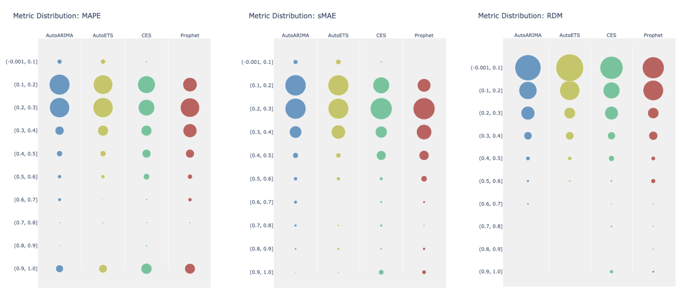
The picture remains consistent - Prophet skews lower, while the three Nixtla models shift upwards. There are no Prophet observations in the highest performance bucket, though the other models sometimes appear there.
Essentially, across all metrics examined, the same story emerges: Prophet performs worse on average than Nixtla’s implementations of these statistical algorithms.
I haven’t yet mentioned execution time - which is perhaps the biggest point here. As you saw in Nixtla’s benchmarks, they are the clear winner in execution speed. I observed the same in my analysis. To give you an idea, I had to build thousands of models for this project. Prophet has many hyperparameters to tune for optimization. Doing so for that many time series took almost two full days on my local machine.
In contrast, using Nixtla on the exact same number of time series and procedure took only about 20-30 minutes.
The takeaway is that if you only have one or two time series, using Prophet and at least trying it is reasonable. But it still makes sense to try simpler traditional statistical algorithms too. However, if you need to scale up to thousands or tens of thousands of time series, I don’t think anyone should use Prophet because, as mentioned, it’s very expensive computationally. For example, the M5 competition contained 100,000 time series. You can imagine how impractical using Prophet would be for a competition at that scale.
Foundation Models
Inspired by large language models people started training transformer based architectures on huge time series datasets. Nixtla was the first to train first foundation model for time series called TimeGPT.
The key idea is - why would you want to have this pre-trained large model for time series? The reason is that with such a pre-trained model, you can perform what’s called zero-shot inference. This means you can take the pre-trained model like TimeGPT, pass in your time series data, and it will generate forecasts without any additional training. This zero-shot inference capability is very powerful and useful.
At some point, once these foundation models become highly accurate and reliable, we’ll likely all use them routinely just as we do large language models today.
Here’s a list of the foundation models for time series released since just last December:
- TimeGPT
- Lag-Llama
- Moment
- TimesFM
- Moirai
- UniTS
- Chronos
Essentially, any company with expertise and resources is trying to train these GPT-like models for the ubiquitous time series domain.
I’ve included some benchmarks comparing the foundation models’ performance. The left table below is for TimeGPT, with the last row showing its results. Bold numbers indicate top performance, while underscores denote second place. You can see TimeGPT is consistently in the top three. However, this benchmark was conducted by Nixtla themselves, so we’d like to see independent evaluations. The right table represents benchmark for the Lagllama model, with sentences highlighted to draw attention. They claim a simple seasonal naive model cannot outperform Lagllama, which is quite surprising.

Nixtla also benchmarked Amazon’s model, finding that a simple statistical ensemble of ARIMA, ETS and CES actually performed better than this expensive model.
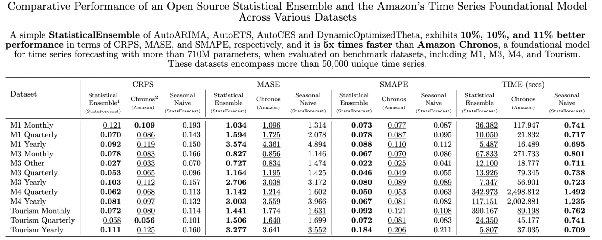
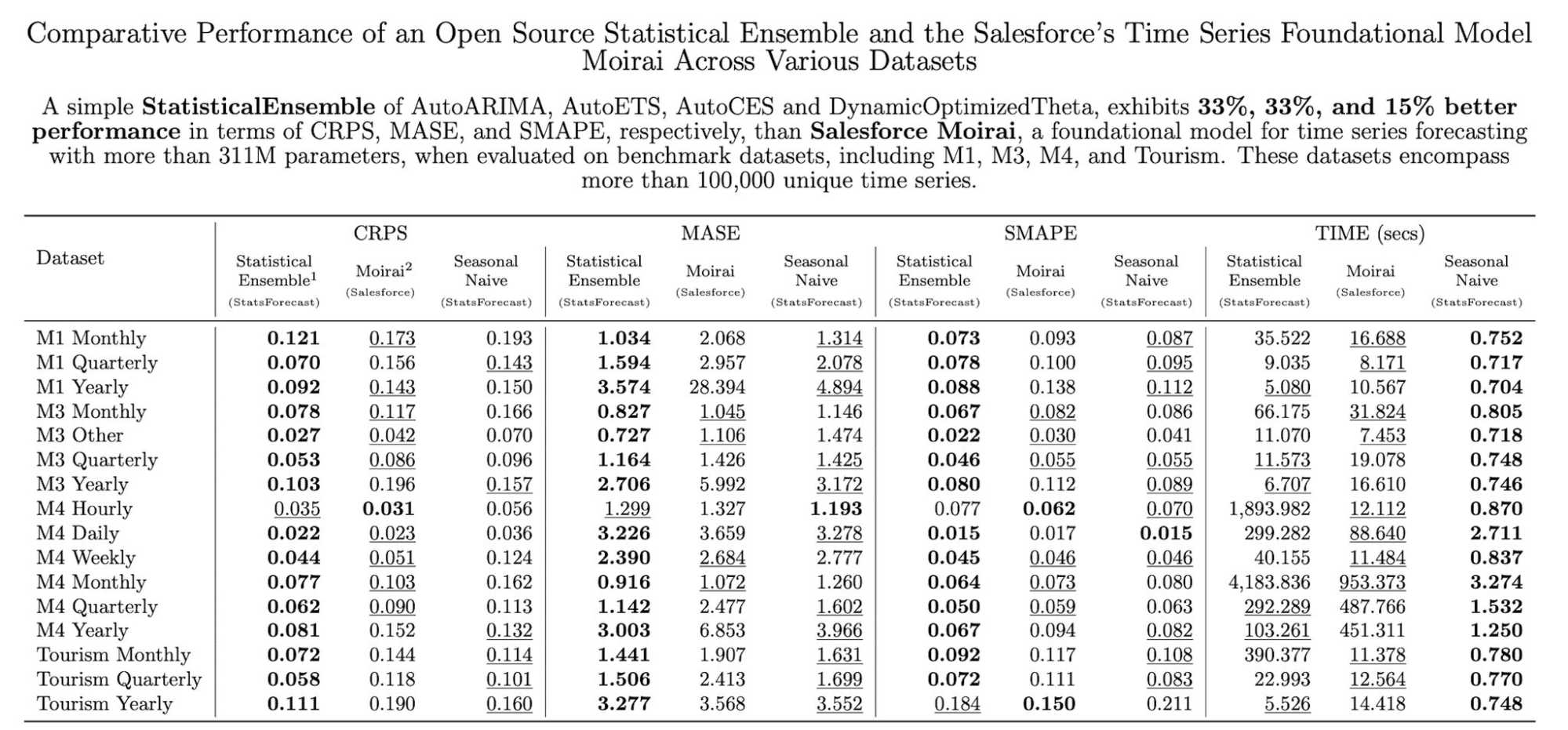
The same holds for Salesforce - they were outperformed by a basic ensemble.
The table below shows benchmark published by Amazon’s team itself.
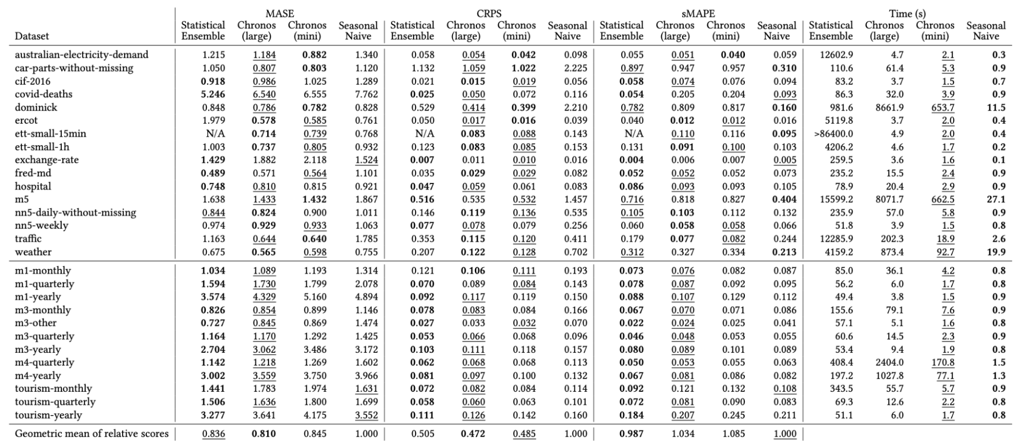
Based on this table, you can see that Chronos outperforms the statistical ensemble shown earlier.
So there’s definitely competition and a race between companies to prove they have the state-of-the-art foundation model, having invested millions to train these massive models on billions of data points. In short, it’s an extremely new field and we don’t yet know what will happen or which approach will prove superior. But I think by year’s end we’ll have a clearer picture of whether foundation models provide value for time series, and which one to potentially trust - Nixtla, Amazon, or someone else.
Best Practice
This is the second and final part of this post. We’ll discuss common mistakes data scientists often make when dealing with time series. The reason, I believe, is that time series is a very specialized domain. Most of data scientists likely come from diverse backgrounds outside statistics or economics, without formal university training in properly handling time series problems. Therefore, we lack the systematic knowledge required, which is why discussing some common pitfalls is useful.
Benchmark
The first point is that you should always benchmark your algorithms or models. A famous example involves the numerous papers published frequently, where researchers design fancy deep learning architectures to forecast stock prices - a lucrative problem if solvable. However, we know stock prices follow a random walk process, where the future value equals the current value plus random noise.
You’ll find papers lacking benchmarks against a naive forecast, which is theoretically the best model for a random walk, simply persisting the last observed value as the forecast. This is the simplest possible model, yet researchers fail to compare against it, despite trying to model a random walk. The chart below shows a neural network forecast (green line) exhibiting no significant difference from the naive forecast (red line) over the horizon.
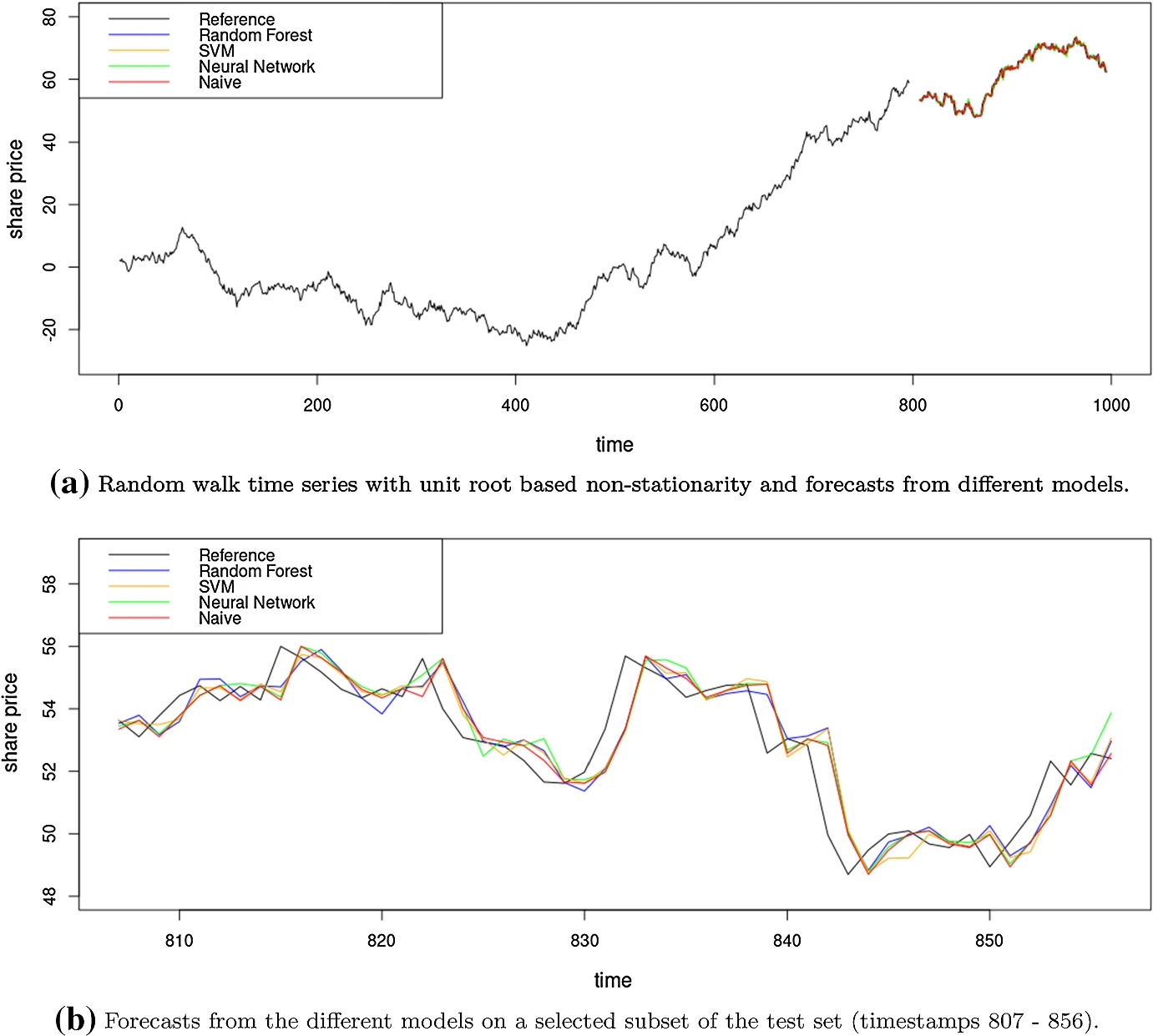
The point is - you should always try to choose an appropriate simple benchmark relevant to the problem, to ensure you’re making reasonable progress. Another issue is testing new algorithms on just 5-10 datasets, which is insufficient.
Leakage
Another classic point is avoiding data leakage - we all know this means processing data only after splitting training/test sets, not before. It can also happen when choosing the wrong forecast horizon. This one is more subtle yet commonly mistaken. Let’s say you want a 1-day ahead forecast model, and create a daily average temperature feature during development. But then the model gets deployed, and a user tries generating a forecast at 2pm while the day isn’t over yet. To compute that daily average temperature at 2pm, they’ll only have partial day data available. However, during training, you computed that feature using the entire day’s data. This results in leakage by using future observations for the training feature.
The third point involves using one time series to forecast another with different lengths - e.g. the independent series has 12 months but the forecast target has 6 months. If not careful with aligning their time periods, future data can leak into the training set.
Partitioning
Data partitioning for time series is also a common issue. We know standard k-fold cross-validation involving random shuffling is invalid, since time series data violates the i.i.d and exchangeability assumptions.
To clarify, when I say “time series”, I don’t just mean a single variable sequence. Any 2D tabular data with a time dimension is effectively a time series problem requiring special handling. Some may not realize a multivariate table is still a time series case.
For time series cross-validation, there are two approaches - fixed origin and rolling origin. Fixed origin means choosing a specific point like Jan 1, 2024 to split training data before that point from the test set after. Rolling origin means incrementing that split point forward through time - Jan 1, Feb 1, Mar 1, etc.
There are multiple options for the rolling origin scenario. The first one is the expanding window. This means that when the origin moves into the future, the training sample gets larger and larger. Because if I started on January 1st, and now I move to February 1st, the entire January has already become part of my training sample. That’s why it’s called an expanding window. The size of the test sample is usually fixed in every scenario. However, in a rolling window, you fix your training size, you fix your test size, and you slide these windows across the time axis. So, the size of the training partition remains constant in a rolling window case.
You can start with an expanding window and switch to a rolling window, or you can do a combination of both, depending on your use case and the size of the time series that you have.
The second point is about standard K-fold cross-validation (CV). I was really surprised when I found out that I could use traditional random shuffling in the case of time series. I didn’t know about this. There are lots of conditions to be met to be able to use standard K-fold for time series. The series has to be stationary, and there should be no correlation between the different folds. The model that you are using should be able to deal with missing values. There are a bunch of conditions. If you are interested in this, have a look at A note on the validity of cross-validation for evaluating autoregressive time series prediction by Bergmeir, et al. But just so you know, you can apply standard CV for time series as well if these conditions are met.
The last piece is about how we should do the data partitioning. If we have a short time series and I can make it stationary somehow, then you can use standard cross-validation for that scenario. But in other cases, you should stick with the time series CV. Again, if I have a long and a lot of data, then a rolling window is nice. If it’s short, then we want to start with expanding because if you have a short time series or a small number of data points, you don’t want to lose your points initially when you start your training. So it’s better to employ the expanding window so that you can accumulate all the future points in your training sample. And then you can switch to the rolling window, it’s up to you if you want to do that.
Metric
If you’re familiar with the time series literature, you’ll remember that there are a bunch of metrics in forecasting literature, a lot of them. One can summarize them, I think, based on this table, at least this table helps me. There are three dimensions in the metrics usually: error, scaling, and aggregation.
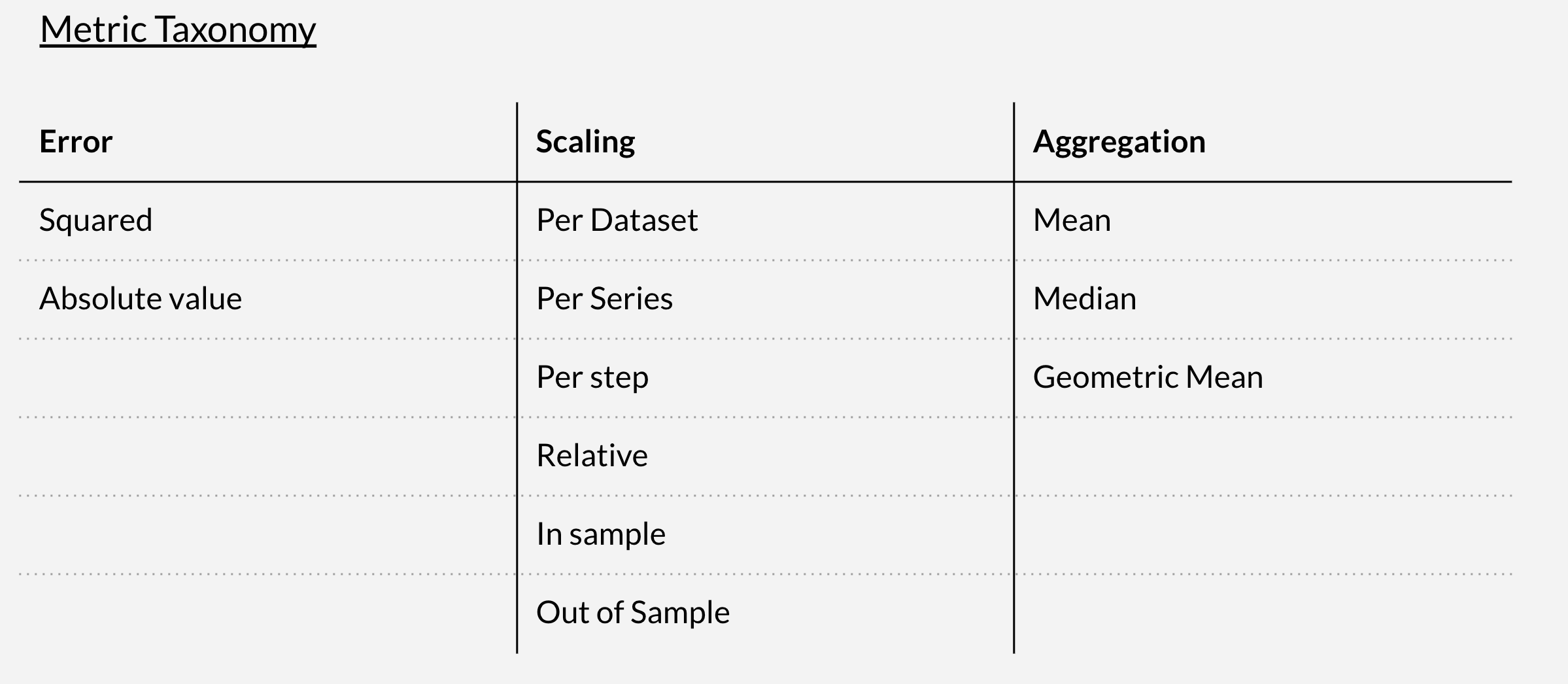
The error is just a difference between the actual value and the forecast, but we have to decide, do we want to take the square or just an absolute value? So we have two values in this dimension.
Then we usually do the scaling. Why do we do the scaling? Because most of the time we have a lot of time series in this data sample and they have different scales. One could range from, I don’t know, 10 to 100 and another could range from 10,000 to 100,000. So in order to be able to compare these time series on different scales, we need to do the scaling to the metric. There are a bunch of different types of scaling you can apply.
For the dataset, what does it mean? If you want to scale, you have to calculate the scaling factor based on your sample. And the question is, on which level should I compute that scaling factor? Is it on the entire dataset, entire series, per step, or relative? So relative is, for example, MAPE is a relative metric because it’s a ratio of the errors.
There is an example of out-of-sample, what does this mean? Usually when they scale the metric, they want to use the base forecaster, like I did in the case of Prophet, Prophet in my calculation was the base forecaster. And they usually use this base forecaster’s errors to scale their original metric. And then you have to decide what kind of errors you want to use, in-sample or out-of-sample, again, depends on your time series.
And finally, all of these are aggregated because we do this comparison for multiple points in time. We are not usually comparing just one forecast. We typically do forecasting, let’s say, for the next seven days or the next 12 months. So, in order to get a single number, I have to aggregate all these 12 numbers if I do a monthly forecast, for example. We can use the mean, median, or geometric mean. The combination of these three dimensions, different combinations, usually creates a bunch of time series metrics.
Points to Choose Right Meeasure
We know that squaring is related to optimizing the mean, while taking the absolute value optimizes the median, right? We know this from machine learning textbooks. Some people say that using a squared error for optimization during the training, and then using the mean absolute error when we evaluate the models, doesn’t make sense because algorithm optimizes the mean and not the median.
Use scale-dependent metrics only for time series with the same scale.
Evaluating your models using multiple metrics is a good practice because you can convince yourself that the model you trained is the best one on multiple different levels. That’s why in papers where they discuss forecasts, usually there are a bunch of metrics that they compute for every model. When the dataset is large, usually all these metrics agree with each other.
R-squared is a very popular, widely used metric in papers and textbooks. But it’s a dangerous one because the purpose of R-squared is slightly different than evaluating forecasts.
MAPE (Mean Absolute Percentage Error) is also very popular. However, it’s not a good idea to use it for small values because MAPE involves a ratio. When you divide by a very small number, it just blows up and doesn’t make sense.
When we have seasonal or heteroscedastic data, it’s not a good idea to use percentage errors. You may have a big peak or dip, so you end up dividing by either a large or small number. It’s better to use per-series/global scaling to address this issue.
For series with trends or structural breaks, using a scaled metric may not be reasonable. A structural break refers to when something happened that caused an abrupt shift in the process, like during COVID-19 when processes suddenly stopped. Computing the scaling factor depends on which time points you use. If it includes COVID-19 data, then that scaling won’t be relevant for other periods. So for trends/breaks, it’s better to use per-step scaling rather than per-series or per-sample scaling.
The third point I already mentioned earlier - you have to decide whether to use in-sample or out-of-sample errors from your base forecaster for scaling. If the test sample is quite different from the training data, then the errors will differ substantially, so you need to carefully select which errors to use for the scaling factor.
Use per-series scaling only for scenarios with no trend. When you have a strong increasing or decreasing trend, computing one scaling factor for the entire series isn’t useful, as you’re applying the same factor to points that may be very different in magnitude. It’s better to scale per step in trending cases.
Regarding outliers, it’s well known that using the average is not ideal. Instead, use the median or absolute errors instead of squared errors to reduce the impact of outliers.
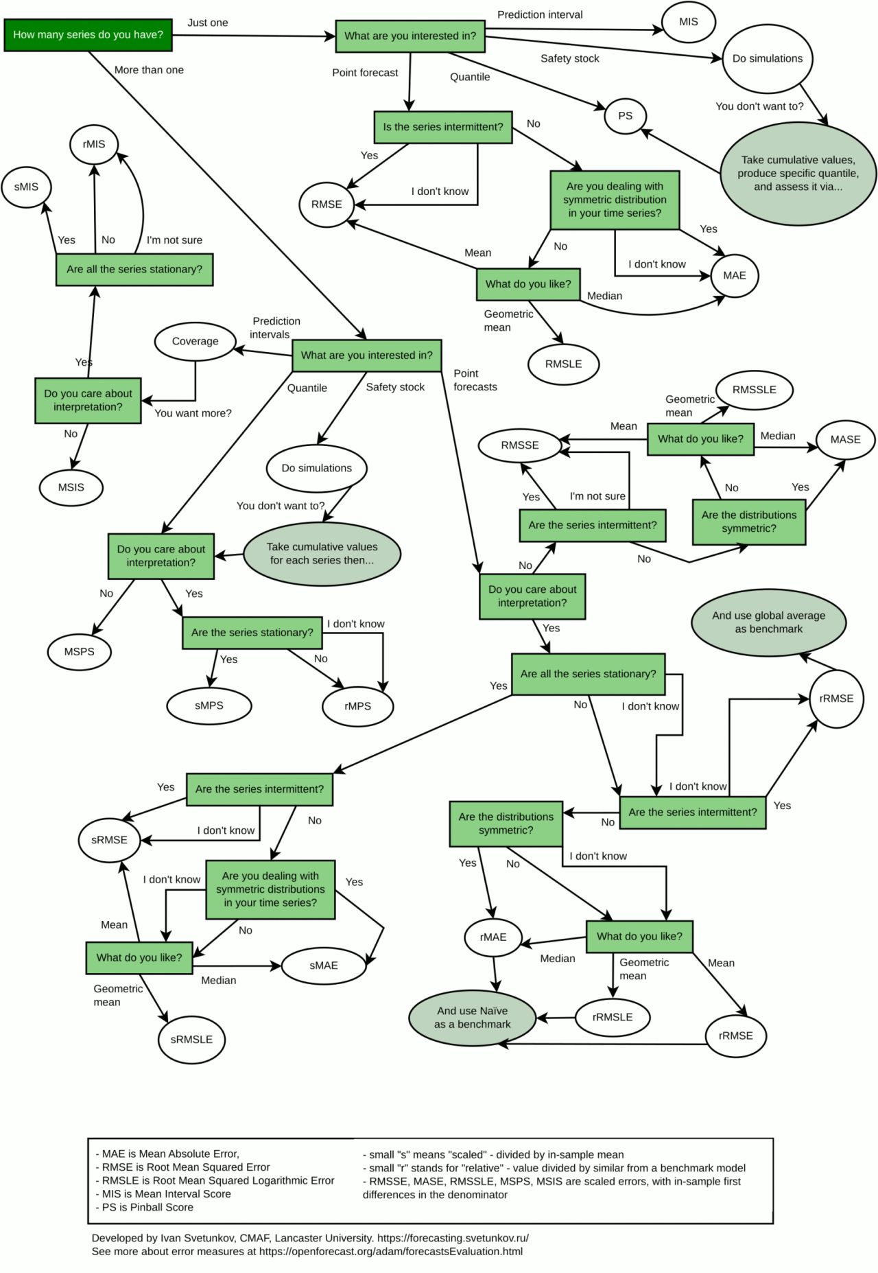
Below is the useful diagram I recently found that starts with a question about your time series and, based on your answers, recommends which type of metric you should use. It can serve as a handy guide.
Do Not Trust Plots
The next point is about judging your forecast based on plots. I’ve seen many people doing this, and it’s not a good idea. For example, we have multiple models trained here - ETS (blue), naive fixed origin (green), and naive rolling origin (red).
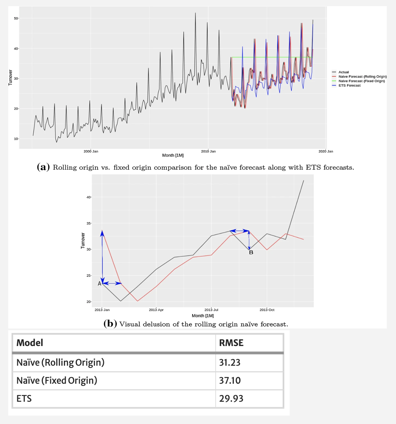
Looking at the plot, you might think the blue ETS line isn’t good because there’s a big difference from the actual data (black line). You might conclude the red line is best. However, looking at the table, ETS (blue) is actually the best performer.
The reason for this discrepancy is that we tend to focus on the small horizontal displacements between the forecast and actual lines, which makes the red line seem closest. But what really matters is the vertical displacement or errors.
The same applies to this random walk example with very simple straight line forecasts. You might think the forecasts can’t be so trivial and choose the yellow or purple line because they have some trend. But again, the table shows the naive model is best.
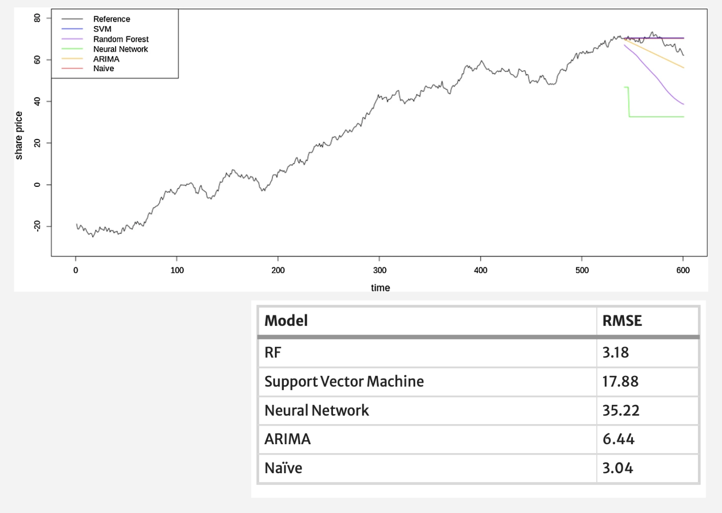
The key takeaway is - we should always judge forecast accuracy based on the metrics, not visual plots alone.
Statistical Significance
When benchmarking, we really want to know whether the observed performance differences are statistically significant or just coincidences from that particular sample realization. Usually, we perform statistical tests to ensure credible results.
This simple diagram recommends tests based on whether comparing two models or more, and whether the normality assumption holds for the errors. For two models, use the t-test if normality holds, otherwise the Wilcoxon test. For more than two models, use ANOVA (F-test) if normality holds, otherwise the Friedman test.
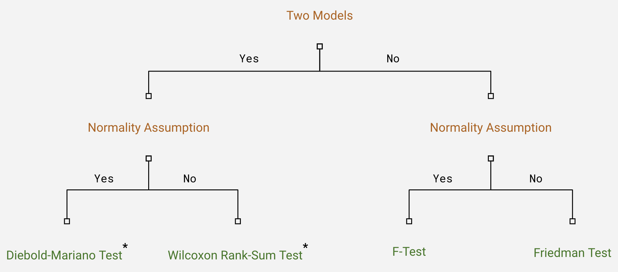
However, tests like Diebold-Mariano and Wilcoxon are designed to compare just two forecast values at a specific time point. In practice, we usually generate multiple forecasts, so need to apply a correction like Bonferroni when performing multiple comparisons to control overall significance levels.
So in summary - avoid being misled by visual plots, use appropriate statistical tests to rigorously assess significance of performance differences, and apply multiple comparison corrections when evaluating across many forecast points or time periods.